Design system for a fintech startup
We built a complete design system for an early-stage fintech: visual identity, color palette, UI components and interactive prototypes ready for development.
The challenge
A new fintech needed to convey security and modernity from a user's very first contact. They had no defined visual identity and no component system their dev team could implement consistently.
The technical team needed clear specs: design tokens, documented component variants and prototypes that acted as a single source of truth. Without that, each developer made visual decisions on their own, which led to an inconsistent interface.
Our goal was to build a complete design system that solved both problems: a visual identity that inspires trust and a component kit that speeds up development.
Our approach
A fintech faces a design challenge of its own: it has to convey security (like a bank) but also accessibility and modernity (like an app). Striking that balance was our priority from day one.
We decided to build the design system before prototyping any screen. That let us define the palette, typography, components and interaction patterns as one coherent language the dev team could implement without ambiguity. Each component was designed across 3 breakpoints and documented with design tokens.
Color palette
A palette that conveys financial trust. The deep blues communicate institutional security, while the lighter tones bring modernity and accessibility.
Navy (#0F172A)
Sidebar, headers, main text
Blue (#1E40AF)
Primary buttons, links, accents
Ice (#F0F9FF)
Backgrounds, surfaces, hover states
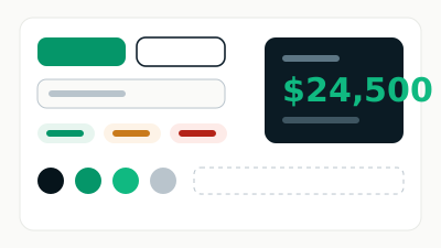
Design system components
Each component was designed with clear variants, documented interactive states and consistent spacing tokens.
Buttons
Primary, Secondary, Danger, Disabled
Text field
Email address
Helper text: valid email format
Status badges
Approved, Pending, Rejected, In progress
Metric card
$24,500 · Available balance
The screens
Dashboard
The user's main panel brings the financial summary, quick actions and latest transactions into one unified view.
Mobile onboarding
The identity verification flow was designed to minimize friction: clear steps, visible progress and direct actions.
Deliverable in numbers
The design system shipped as a versioned Figma library, with usage documentation for every component.
40+
Components
3
Breakpoints
12
Prototyped screens
100%
Tokens documented
Got a project in mind?
Tell us what you need and we'll reply by email, no strings attached.
Or email us at contacto@teslerlab.com